Dark green color is a rich and versatile part of the green family. It can range from deep forest tones to muted olive shades and jewel-like greens. Because of this variety, dark green appears in home interiors, fashion, branding, web design, artwork, and seasonal color palettes. It can look natural and earthy in one setting while appearing luxurious and dramatic in another.
The exact appearance of dark green depends on its undertone, lighting, material, and surrounding colors. A blue-based green may feel cooler, while a yellow-based green can appear warmer and more organic. Understanding these differences makes it easier to choose the right shade for decorating a room, designing a website, creating an outfit, or developing a brand identity.
What Is Dark Green Color?
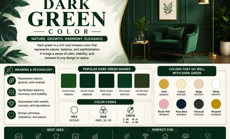
Dark green color generally refers to green shades with lower brightness and greater depth than lighter greens. It is not one single universal color. Instead, it is a broad category that includes forest green, hunter green, bottle green, deep olive, pine green, and several other shades.
Different dark greens can contain blue, yellow, gray, brown, or black undertones. These undertones strongly affect how the color looks. A dark green with blue undertones may appear cooler and more refined, while one with yellow or brown undertones can feel warmer, softer, and more connected to natural landscapes.
Dark Green Color Meaning
Dark green is often associated with nature, forests, plants, stability, growth, and maturity. In some settings, it may also suggest wealth, tradition, heritage, or sophistication. These meanings are often influenced by how the color is used and which other shades appear around it.
Color symbolism is not universal. Personal experiences, cultural background, and design context can all change how someone interprets a color. For example, dark green may feel calm and natural in a bedroom, professional in a financial brand, or luxurious when combined with gold in packaging or interior design.
Dark Green Color Psychology
In design and branding, dark green is often used when a company wants to communicate qualities such as stability, nature, maturity, or sustainability. It can also create a more serious visual impression than bright or lime green. Luxury brands sometimes combine deep green with gold or black to produce a more refined appearance.
These associations should not be treated as scientific guarantees. A color cannot automatically create trust, calmness, or confidence. Its effect depends on the full design, including typography, imagery, contrast, messaging, and cultural context. Dark green works best when it supports the overall style rather than carrying the entire message alone.
Dark Green Hex Code and RGB Values
Because dark green is a broad color category, there is no single official HEX code that represents every dark green shade. One commonly used digital example is HEX #006400, which has RGB values of 0, 100, and 0. This represents a strong, deep green with no red or blue added.
Other shades can look completely different while still being called dark green. Forest green, hunter green, olive green, and bottle green all use different color values. Screen settings can also change how these colors appear, so designers should always test shades on the devices and materials where they will actually be used.
Popular Dark Green Shades
Forest green is inspired by dense foliage and usually has a balanced, slightly cool appearance. Hunter green is often darker and more muted, sometimes with blue or gray undertones. Bottle green is deep and polished, while pine green can feel cooler and more natural.
Emerald green is usually brighter and more jewel-toned, while dark olive green contains warmer yellow and brown undertones. Racing green is traditionally deep and elegant, and moss green tends to feel softer and earthier. These names are not completely standardized, so the exact shade can vary between brands and industries.
Forest Green Versus Dark Green
Dark green is the wider category, while forest green is one specific type within that category. Forest green generally reflects the color of thick woodland and natural foliage. It often feels balanced and slightly cool, though some versions may contain warmer undertones.
People sometimes use dark green and forest green interchangeably, but they are not always identical. A dark green could be almost black, olive-based, blue-based, or gray-toned. Forest green usually keeps a clearer connection to natural leafy greens and often appears slightly more vivid than extremely deep green shades.
Hunter Green Versus Dark Green
Hunter green is another well-known shade within the dark green family. It is usually deep, muted, and traditional, often containing subtle blue or gray undertones. This makes it less bright than emerald green and sometimes more formal than forest green.
Hunter green is commonly used in furniture, formal clothing, traditional interiors, and branding. It works well with cream, beige, gold, dark wood, and black. Because different manufacturers use slightly different formulas, one product labeled hunter green may not look exactly like another.
Emerald Green Versus Dark Green
Emerald green is usually richer, brighter, and more jewel-like than many traditional dark greens. It often has a stronger blue undertone and greater saturation, making it appear more vibrant. Dark green shades such as forest or hunter green usually feel more muted and natural.
Emerald is often used when a design needs drama or luxury, especially in velvet furniture, formal clothing, jewelry-inspired branding, or event decor. However, deep emerald shades can still appear quite dark. The difference usually comes from brightness, saturation, and undertone rather than one exact color code.
Dark Olive Green
Dark olive green has a warmer and earthier appearance than many blue-based greens. It usually contains yellow, brown, or gray undertones, which can make it feel muted and natural. This shade is commonly used in fashion, military-inspired styles, rustic interiors, and outdoor branding.
It pairs especially well with beige, cream, tan, brown, black, rust, and gold. Dark olive also works nicely with natural materials such as wood, leather, linen, and stone. Compared with emerald or forest green, it usually creates a softer and more understated visual effect.
Dark Green Color Combinations
Dark green can work with many colors because it can function as both a strong statement shade and a deep neutral-like base. The best combination depends on the style you want. Light neutrals create contrast, warm metallics add luxury, and earth tones strengthen its natural appearance.
Undertones are important when creating a palette. A blue-based dark green often pairs well with cool gray, navy, and silver, while warmer greens can look better with cream, tan, brown, rust, and gold. Testing colors together before making a final decision helps avoid unwanted clashes.
Dark Green and White
Dark green and white create a clean, high-contrast combination. White prevents the green from feeling too heavy and helps highlight its richness. This pairing is popular in kitchens, living rooms, websites, branding, and clothing because it looks simple while still having strong visual impact.
Warm white and cream create a softer look, while bright white produces stronger contrast. In interiors, dark green cabinets with white countertops can feel modern and elegant. In digital design, white text may work on dark green backgrounds, but contrast should always be checked carefully for readability.
Dark Green and Beige
Beige creates a softer, warmer relationship with dark green. This pairing often feels calm and natural because both colors work well with wood, stone, and other earthy materials. It can be especially effective in bedrooms, living rooms, minimalist spaces, and casual fashion.
Different beige shades create different effects. Warm sand tones make the palette feel more relaxed, while taupe can create a more modern look. Cream adds brightness without the sharp contrast of pure white. This combination works particularly well when dark green is used as the main color and beige balances it.
Dark Green and Black
Dark green and black create a dramatic and sophisticated palette. Because both colors are deep, the combination can feel modern and powerful. It is commonly seen in fashion, luxury branding, furniture, and darker interior styles.
The main challenge is that very dark colors can blend together and reduce visual contrast. Adding cream, white, silver, light wood, or warm lighting can prevent the design from feeling too heavy. In websites and graphic design, accessibility should also be checked carefully when using dark green and black together.
Dark Green and Gold
Gold is one of the most popular colors to pair with deep green. The warm metallic tone contrasts with the cool richness of many dark green shades, creating a luxurious and elegant appearance. This combination appears frequently in weddings, packaging, bedrooms, living rooms, and formal fashion.
Brass and antique gold create a softer, more traditional look, while bright polished gold feels more glamorous. Dark green walls with brass lighting or cabinet hardware can create a refined interior. In branding, the combination should still be supported by clear typography and good layout rather than relying only on color.
Dark Green and Pink
Pink can soften dark green or create strong contrast depending on the shade used. Blush and dusty pink produce a gentle, romantic palette, while hot pink creates a much bolder and more energetic combination.
This pairing works well in fashion, interiors, social media graphics, and event decor. A dark green sofa with pale pink cushions can feel soft and balanced, while a bright pink accessory against deep green creates a stronger statement. The combination becomes easier to manage when one color remains dominant and the other is used as an accent.
Dark Green and Blue
Blue and dark green can create a layered, cool-toned palette. Navy blue feels deep and sophisticated beside green, while light blue adds contrast and freshness. Teal can create a smoother transition between the two colors because it already combines blue and green qualities.
Because these colors can be visually similar, adding cream, white, or light gray helps separate them. In fashion, dark green trousers with a navy jacket can work when textures and accessories provide enough contrast. In interiors, combining both shades with lighter neutral elements prevents the room from appearing too dark.
Dark Green and Gray
Gray gives dark green a modern and balanced appearance. Light gray creates clear contrast, while charcoal produces a darker and more dramatic combination. Warm gray can soften green, while cooler gray shades create a cleaner contemporary look.
This pairing works particularly well in offices, modern homes, technology branding, and minimalist designs. Dark green furniture against a light gray wall can create visual interest without overwhelming the room. Adding wood, cream, or metallic accents can make the overall palette feel warmer and more comfortable.
Dark Green and Brown
Brown and dark green naturally work together because both colors are strongly associated with outdoor landscapes. Dark wood, tan leather, walnut, camel, and chocolate brown can all create rich combinations with deep green shades.
This palette works especially well in rustic, vintage, traditional, and nature-inspired interiors. A dark green wall with walnut furniture can look warm and sophisticated, while green clothing paired with brown leather accessories creates an earthy style. Lighter neutral colors can be added to prevent the palette from becoming too dark.
Dark Green and Yellow
Yellow adds warmth and energy to dark green. Mustard yellow is especially effective because it has enough depth to balance a strong green without creating excessive contrast. Golden yellow can create a richer look, while pale yellow produces a softer effect.
This pairing works well in autumn-inspired interiors, fashion, branding, and decorative accessories. A small mustard cushion on a dark green sofa can add visual interest without taking over the room. Using yellow as an accent is often easier than combining both colors in equal amounts.
Dark Green Color Palette Ideas
A nature-inspired palette can combine dark green with beige, cream, brown, and warm white. This works well for interiors, lifestyle branding, and outdoor-inspired designs. A luxury palette may include dark green, gold, black, and ivory, creating a deeper and more polished appearance. For more inspiration on coordinating colors across outfits, decorations, and themed spaces, see our Frat Style Theme guide.
For a modern palette, combine dark green with gray, white, and charcoal. A softer palette can use blush pink, cream, and light gray. People wanting a bold design might mix dark green with hot pink, orange, or gold, although stronger colors should be balanced carefully to avoid visual overload.
Dark Green in Interior Design
Dark green can add depth and character to an interior when used thoughtfully. It works on walls, cabinets, sofas, chairs, curtains, rugs, and smaller decorative accessories. A single accent wall can introduce the color without making the entire room feel dark. For more kitchen inspiration, explore our range hood ideas for modern and traditional spaces that can complement bold cabinet and wall colors.
Lighting is one of the most important factors. A deep green paint may look rich in a bright room but almost black in a space with limited natural light. Always test paint samples at different times of day before covering a large area, because lighting and paint finish can significantly change the final appearance. Thoughtful lighting can also change how deep colors appear, so explore our guide to lighting design for every room when planning a dark green interior.
Dark Green Living Room Ideas
Dark green works especially well in living rooms because it can create a strong focal point. A green sofa, velvet chair, accent wall, or set of curtains can add depth without requiring a complete room makeover.
Pairing dark green with cream walls, warm wood furniture, brass lighting, or beige rugs creates balance. Plants can also strengthen the natural feel, although the room does not need to become fully botanical. Lighter accessories help prevent dark green furniture and walls from making the space feel visually heavy.
Dark Green Bedroom Ideas
In bedrooms, dark green can create a rich and intimate atmosphere. It works well on feature walls, upholstered headboards, bedding, curtains, or decorative cushions. Pairing it with cream or white keeps the room feeling balanced.
Blush pink, warm wood, and gold accents can add softness and warmth. Lighting should be considered carefully because a dark green wall may look significantly deeper at night. Using warm lamps and lighter bedding can help maintain contrast while allowing the green to remain the main visual feature.
Dark Green Kitchen Ideas
Dark green cabinets have become a popular way to bring color into a kitchen without using overly bright tones. They can work with white countertops, marble, brass hardware, black fixtures, and both light and dark wood.
The finish makes a major difference. Matte dark green can feel modern and soft, while glossy finishes may reflect more light. Because kitchen lighting varies throughout the day, testing cabinet or paint samples before making a final decision is especially important.
Dark Green in Fashion
Dark green can act like an alternative neutral in clothing. It works well in jackets, trousers, dresses, shirts, suits, shoes, and accessories. Because it is less common than black or navy, it can add personality while remaining relatively easy to combine.
White, beige, camel, gray, black, navy, denim, and gold all pair well with dark green clothing. For a casual outfit, dark green pants can work with a white shirt and sneakers. For formal styling, a deep green dress or suit can be combined with neutral or metallic accessories.
Dark Green for Branding and Graphic Design
Dark green is commonly used in branding connected with nature, finance, wellness, outdoor products, food, and luxury goods. It can suggest maturity, stability, or environmental themes, but the overall message depends on the complete brand system.
Designers should pay attention to readability and accessibility. Dark green backgrounds may require light text, but contrast should be checked instead of assumed. Typography, spacing, imagery, and color balance are equally important. A strong color cannot compensate for unclear messaging or poor visual structure.
How to Make Dark Green Color
When mixing traditional paint, green is usually created by combining blue and yellow. To make the mixture darker, add a very small amount of black, dark blue, or another deep pigment. The exact result depends on the original blue and yellow used.
Dark pigment should be added gradually because a small amount can quickly change the color. Adding more blue can create a cooler dark green, while adding brown may create an earthier shade. Always test small amounts before mixing a large quantity.
How to Lighten or Darken Green
White can lighten dark green, although it may also make the color softer and more muted. Adding yellow can create a lighter and warmer green, while using a lighter green paint may preserve more brightness.
To darken green, black is the most direct option, but navy blue, brown, or even a tiny amount of purple can also work. Each choice changes the undertone differently. Add dark colors slowly because too much can make the mixture muddy or nearly black.
Common Mistakes When Using Dark Green
One common mistake is using too much dark green in a room with very little light. This can make the space feel heavier than expected. Another mistake is choosing a shade from a screen without testing it on the actual wall, fabric, or printed material.
Ignoring undertones can also cause problems. A warm olive green may clash with very cool colors, while a blue-based green may not work well with every brown or beige. Testing samples together under the correct lighting is one of the easiest ways to avoid these issues.
Conclusion
Dark green color is a flexible and visually powerful choice that can work in interiors, fashion, branding, digital design, and artwork. It includes many different shades, from forest and hunter green to deep olive and jewel-inspired emerald tones.
The right shade depends on undertone, lighting, material, and surrounding colors. Dark green works especially well with white, beige, gold, pink, gray, brown, and black. Testing colors in their real environment is always better than choosing them based only on online images or screen previews.
FAQs
What is the dark green color code?
There is no single official code for every dark green shade. One common digital example is HEX #006400 with RGB values of 0, 100, and 0. Forest green, hunter green, olive, and other dark greens use different values.
What colors go well with dark green?
Dark green pairs well with white, beige, cream, black, gold, gray, brown, pink, navy, and mustard yellow. The best choice depends on the specific green undertone and whether you want a soft, natural, modern, or dramatic look.
Is forest green the same as dark green?
Forest green is one type of dark green, but the terms are not always identical. Dark green is a broad category that includes forest, hunter, olive, bottle, pine, and many other deep green shades.
What does dark green color symbolize?
Dark green is often associated with nature, growth, stability, maturity, wealth, and tradition. These meanings are not universal and can change depending on culture, personal experience, and the context in which the color is used.
Does dark green go with black?
Yes, dark green and black can create a sophisticated and dramatic combination. Because both colors are deep, adding lighter accents such as white, cream, silver, or light wood can improve contrast and keep the overall design from feeling too heavy.
How do you make dark green paint?
Mix blue and yellow to create green, then gradually add a small amount of black, dark blue, or another deeper pigment. Add dark colors slowly because even a small amount can strongly change the final shade.